CSS Positioning Lab
Lab Objectives
By the end of this lab, students will be able to...
- Identify sections of web page and select elements in CSS using context operators
- Effectively use CSS to position elements on a web page
- Explain the differences between common positioning types: absolute, relative, float
- Relate common display types (block and inline) to the box-model layout used in web browsers
- Research web resources for CSS positioning information
Instructions
In this lab you will use CSS positioning to layout elements of the PRZ web site pages, building on the work that you did from the previous lab. Note: If you haven't completed the CSS Formatting Lab, you can work most of the current lab using the template file from the CSS Formatting exercise. Download and Extract the CSS Formatting lab zipped files into a directory and work from there.
- Make a duplicate copy of the local directory where you have stored the CSS Formatting lab. Name this duplicate directory css_positioning.
- In the new directory, open the template.html file in your HTML editor of choice.
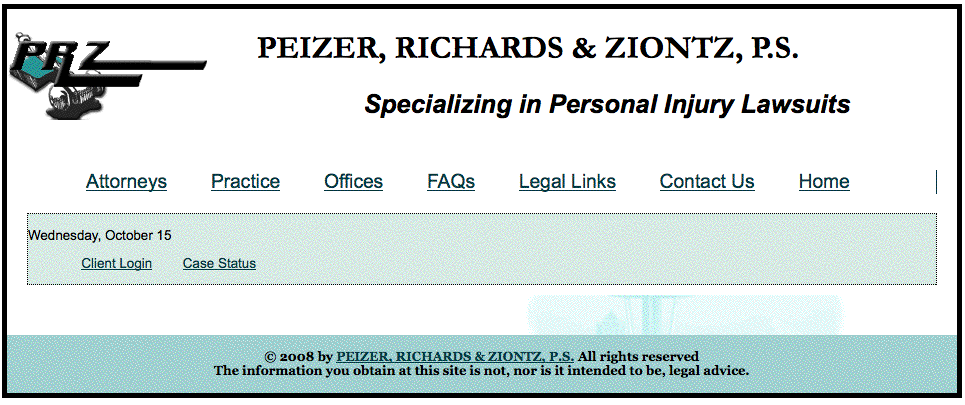
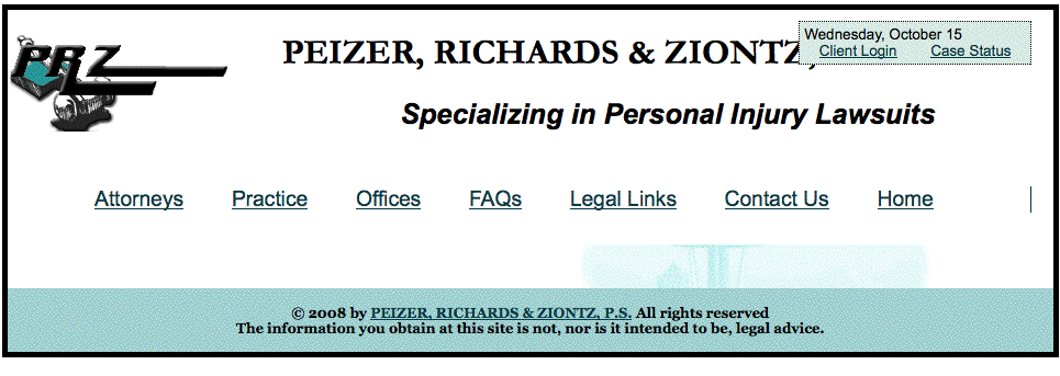
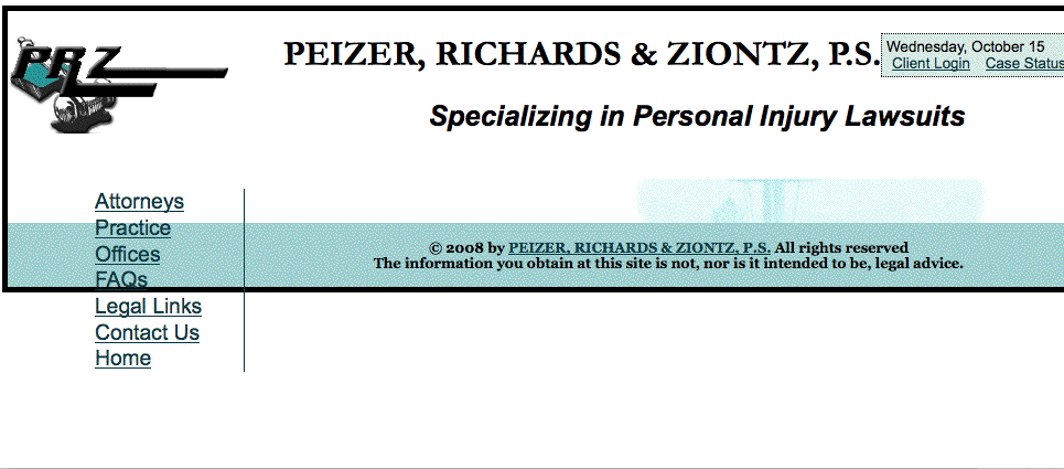
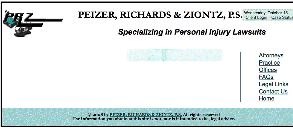
- Add a new navigation section defined by <nav> tag immediately following the other navigation section.
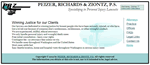
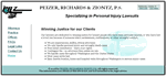
<!-- Client navigation: showing on every page in the site -->
	<nav id="clientNav">
            <p class="date">Wednesday, January 15</p>
            <ul>
            	<li><a href="#">Client Login</a></li>
            	<li><a href="#">Case Status</a></li>
            </ul>
	</nav>
Format the client navigation element using the format.css style sheet
- Open and review the CSS file format.css paying attention to the id selector (#) for CSS positioning.
- Edit the CSS file to add the following styling to the #clientNav section (defined by the id attribute in the HTML)
- Add font styling using a compound declaration.
font: 0.7em/1.1em Arial, Helvetica, sans-serif;
(Note the use of the size/line-height syntax: .7em size and 1.1em line height) - Add a border around the #clientNav section.
Make the border thin, black, and dotted.
- Give the entire section a background-color of #D7EAE4;
- Add font styling using a compound declaration.
- Adjust the <li> elements in #clientNav to display inline.
- Save the CSS changes and View the page. Notice any differences you see compared to the image.
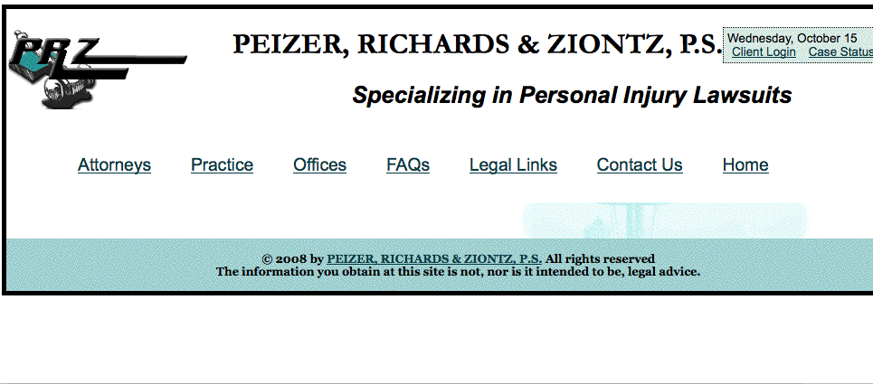
Link a new style sheet to your HTML and add Positioning styles for the client Navigation
- Create a new CSS style sheet named layout.css and save it in the styles directory in the CSS_Positioning directory. You will be working with this style sheet through the rest of the lab.
- Add a new <link> tag just after the existing one within the <head> section of the template.html file
<link rel="stylesheet" href="styles/layout.css" type="text/css" />
- Edit the CSS file to add appropriate positioning styles for the #clientNav section of the HTML. Notice that you may repeat some of the same selectors used in the format.css file, but with different rules for padding, margin, and positioning.
- Use position:absolute to place the #clientNav section 20px from the top and 30px from the right edge of its parent element, the <body>.
- Add 5px padding all-around the #clientNav section
- Set both padding and margin to zero for the <ul> and <p> elements in #clientNav
- Add 5px of padding to the left and right of <li> elements in #clientNav and set its border to none
- Save the CSS changes and View the HTML in the browser. Notice any differences you see.
Change the page's minimmum width and positioning context for the client navigation section
Did you notice the client navigation section overlaps the page headings as the width of the browser window gets smaller. It's not pretty. Here is how to fix this:
- Edit the CSS file layout.css to add positioning styles for the body element
- To keep the page from collapsing when the browser window is made too narrow, set the <body> element's minimum width, min-width, to 1000px
- Save the CSS changes and View the HTML in the browser. This still doesn't work.
- Notice the page border shows that the page does have a minimum width, but the client navigation section still overlaps the page headings as the width of the browser window gets smaller.The problem is that the #clientNav doesn't recognize the body as its positioning context. Instead, the client navigation takes its positioning cues from the edge of the containing window.
- Make the body the positioning context for its descendents by giving it a position style. Apply the position:relative rule to the body.
- Save the CSS changes and View the HTML in the browser. Notice what happens to the positioning of the client navigation section as the width of the browser window gets smaller than the width of the page text.
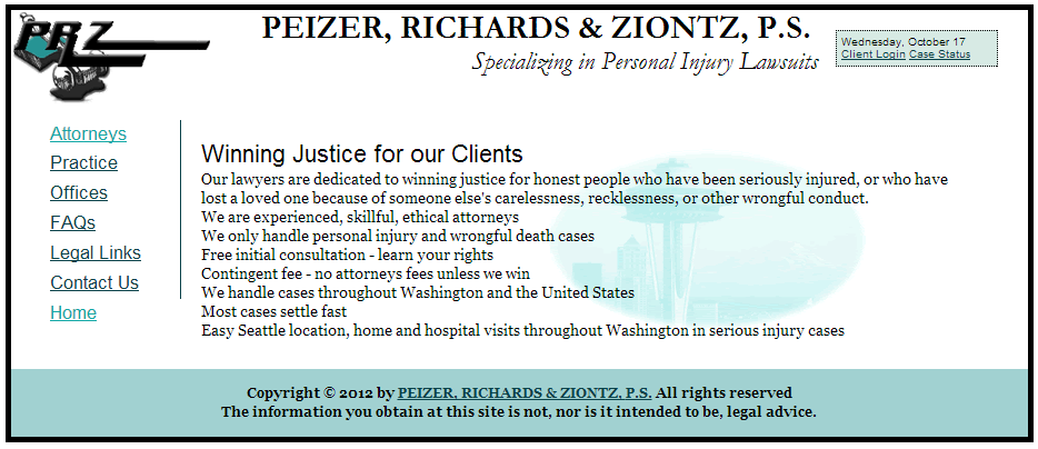
Change the Main Navigation to left-hand (or right-hand) positioning using float
- Edit the CSS file layout.css to add left-hand positioning styles for the <nav> section of the HTML.
- Set the <nav> section to a width of 150px.
- Position the <nav> section on the left-hand side using float:left
- Set all the<li> elements in the <nav> section to display:block
- Notice the right border of the <li> elements in the <nav> section acts as the separator bar between the navigation and content.
- Apply a 50px margin to the left and right of the #content section and 10px margin to the top and bottom
- Save the CSS changes and View the HTML. Also notice what happens to the footer section.
Whoops! By floating the navigation, all elements that follow it, like the footer, try to "float" around it unless we tell them to stop.
Adjust the footer to correct the flow
- Edit the CSS to clear the float from the <footer> using the style clear:left so that the footer ignores the float, and moves back into the normal page layout flow.
- Save the CSS changes and View the HTML in the browser. Notice any differences you see and correct.
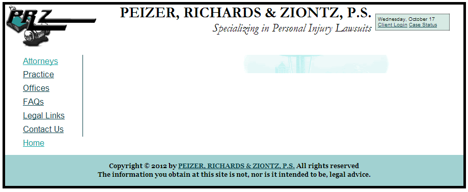
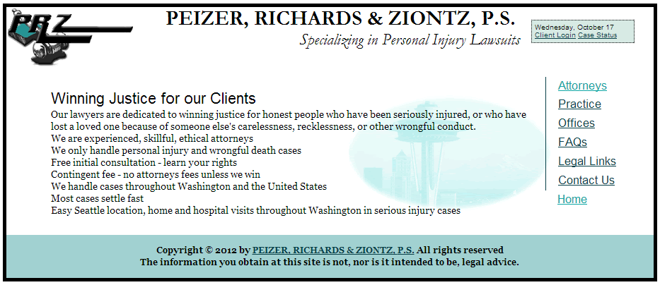
Shift the main navigation to the right side of the page
- Modify the CSS styles necessary to move the main navigation to the right-hand side as shown. Be sure that you adjust the separator .
- Save the CSS changes and View the HTML in the browser. Notice any differences you see and correct.
Update all of the HTML pages in the PRZ site and upload to your course portfolio
- Add the new navigation section that includes the client navigation to all of the .html pages in the PRZ site using the same template "save-as"technique from the previous lab: Open your new template, Copy content, Save-As, repeat.
- Save the CSS changes and View the HTML in the browser. Notice any problems in formatting or positioning.
 Adjust any of the formatting or positioning styles as needed to display the navigation on either the left or the right on every page (your choice).
 - Upload and link your file to your course portfolio site
- Be sure your page is viewable at http://studentfolders.student.cascadia.edu/bit112/